1. Material UI là gì?
Material UI (MUI) là một thư viện giao diện người dùng (UI Library) dành cho React, được xây dựng dựa trên triết lý Material Design của Google.
Mục tiêu của MUI là mang lại trải nghiệm giao diện trực quan, hiện đại và dễ sử dụng, giúp các lập trình viên xây dựng ứng dụng React nhanh chóng mà vẫn đảm bảo tính thẩm mỹ.
Ra mắt lần đầu năm 2014, đến nay MUI đã trở thành thư viện UI phổ biến nhất cho React với hơn 90k+ ⭐ trên GitHub và được sử dụng rộng rãi trong hàng nghìn dự án trên toàn thế giới.
2. Công nghệ nền tảng của Material UI
MUI được phát triển dựa trên:
- ⚛️ React – cấu trúc component mạnh mẽ, tái sử dụng cao.
- 🟦 TypeScript – tăng tính ổn định và dễ mở rộng.
- 🎨 CSS-in-JS (Emotion) – cho phép tuỳ chỉnh style linh hoạt và tối ưu hiệu năng.
- 💡 Tích hợp tốt với các framework hiện đại: Next.js, Vite, Remix, CRA,…
3. Hướng dẫn sử dụng Material UI cơ bản
🔧 Cài đặt Material UI:
npm install @mui/material @emotion/react @emotion/styled⚙️ Import và sử dụng component:
import Button from '@mui/material/Button';

function App() {
  return <Button variant="contained">Click Me</Button>;
}
🎨 Tùy chỉnh giao diện (Theme Customization):
import { createTheme, ThemeProvider } from '@mui/material/styles';
import Button from '@mui/material/Button';

const theme = createTheme({
  palette: {
    primary: { main: '#1976d2' },
  },
});

function App() {
  return (
    <ThemeProvider theme={theme}>
      <Button color="primary" variant="contained">Custom Theme</Button>
    </ThemeProvider>
  );
}💡Mẹo: Dùng công cụ MUI Theme Builder để tạo giao diện phù hợp với thương hiệu của bạn.
4. Một số component quan trọng trong Material UI
Material UI cung cấp hơn 80 component khác nhau giúp bạn xây dựng giao diện React nhanh chóng. Dưới đây là một số component phổ biến và quan trọng mà mọi lập trình viên nên biết:
4.1. Button – Nút bấm
Button là component cơ bản và được dùng thường xuyên nhất trong mọi ứng dụng web.
MUI cung cấp nhiều biến thể và trạng thái giúp bạn tạo ra nút phù hợp với từng mục đích.
🔹Dùng khi: Thực hiện hành động, submit form, mở modal, v.v.
🔹Điểm nổi bật: hỗ trợ nhiều kiểu (contained, outlined, text), có thể thêm icon, trạng thái loading, hoặc kích thước tùy chỉnh.
import Button from '@mui/material/Button';

<Button variant="text">Text</Button>
<Button variant="contained" color="primary">Contained</Button>
<Button variant="outlined">Outlined</Button>

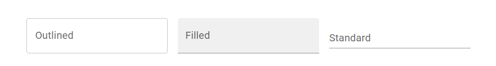
4.2. TextField – Ô nhập liệu
TextField là thành phần nhập dữ liệu cơ bản trong các form. Hỗ trợ nhiều biến thể, trạng thái và tính năng nâng cao như helper text, validation, icon hoặc multiline.
🔹 Dùng khi: Form đăng nhập, đăng ký, tìm kiếm hoặc nhập dữ liệu.
🔹 Ưu điểm: Tích hợp tốt với form libraries (Formik, React Hook Form,…).
import * as React from 'react';
import Box from '@mui/material/Box';
import TextField from '@mui/material/TextField';

export default function BasicTextFields() {
  return (
    <Box
      component="form"
      sx={{ '& > :not(style)': { m: 1, width: '25ch' } }}
      noValidate
      autoComplete="off"
    >
      <TextField id="outlined-basic" label="Outlined" variant="outlined" />
      <TextField id="filled-basic" label="Filled" variant="filled" />
      <TextField id="standard-basic" label="Standard" variant="standard" />
    </Box>
  );
}
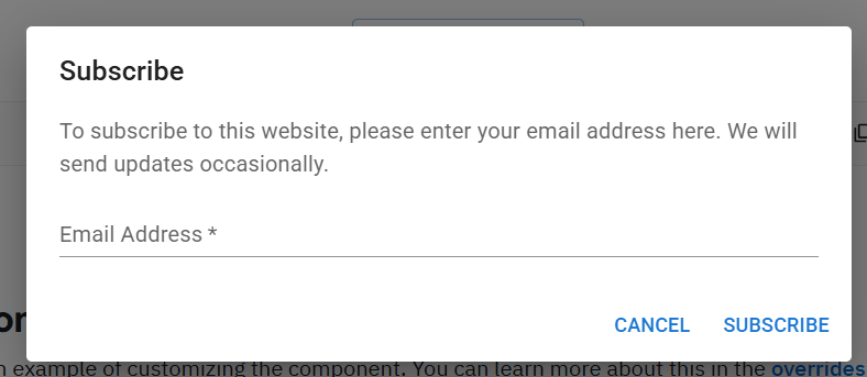
4.3 Dialog – Hộp thoại (Modal)
Dialog giúp hiển thị thông tin, form, hoặc xác nhận hành động mà không rời khỏi trang chính.
Nó có thể chứa tiêu đề, nội dung, và nhóm nút hành động.
🔹 Dùng khi: Hiển thị thông báo, xác nhận, hoặc yêu cầu nhập thông tin.
🔹 Ưu điểm: Dễ mở/đóng bằng state, hỗ trợ focus tự động và form nội tuyến.
import * as React from 'react';
import Button from '@mui/material/Button';
import TextField from '@mui/material/TextField';
import Dialog from '@mui/material/Dialog';
import DialogActions from '@mui/material/DialogActions';
import DialogContent from '@mui/material/DialogContent';
import DialogContentText from '@mui/material/DialogContentText';
import DialogTitle from '@mui/material/DialogTitle';

export default function FormDialog() {
  const [open, setOpen] = React.useState(false);

  const handleClickOpen = () => {
    setOpen(true);
  };

  const handleClose = () => {
    setOpen(false);
  };

  const handleSubmit = (event: React.FormEvent<HTMLFormElement>) => {
    event.preventDefault();
    const formData = new FormData(event.currentTarget);
    const formJson = Object.fromEntries((formData as any).entries());
    const email = formJson.email;
    console.log(email);
    handleClose();
  };

  return (
    <React.Fragment>
      <Button variant="outlined" onClick={handleClickOpen}>
        Open form dialog
      </Button>
      <Dialog open={open} onClose={handleClose}>
        <DialogTitle>Subscribe</DialogTitle>
        <DialogContent>
          <DialogContentText>
            To subscribe to this website, please enter your email address here. We
            will send updates occasionally.
          </DialogContentText>
          <form onSubmit={handleSubmit} id="subscription-form">
            <TextField
              autoFocus
              required
              margin="dense"
              id="name"
              name="email"
              label="Email Address"
              type="email"
              fullWidth
              variant="standard"
            />
          </form>
        </DialogContent>
        <DialogActions>
          <Button onClick={handleClose}>Cancel</Button>
          <Button type="submit" form="subscription-form">
            Subscribe
          </Button>
        </DialogActions>
      </Dialog>
    </React.Fragment>
  );
}
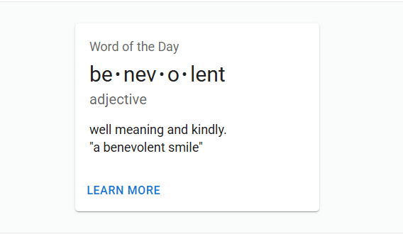
4.4. Card – Khung nội dung tổng hợp
Card là container giúp hiển thị thông tin cô đọng như sản phẩm, bài viết hoặc profile.
Thường kết hợp với CardMedia, CardContent, CardActions để tạo bố cục trực quan.
🔹 Dùng khi: Danh sách sản phẩm, bài viết, thẻ người dùng, thông tin tổng quan.
🔹 Ưu điểm: Bố cục linh hoạt, dễ phối hợp với Grid hoặc Stack.
import * as React from 'react';
import Box from '@mui/material/Box';
import Card from '@mui/material/Card';
import CardActions from '@mui/material/CardActions';
import CardContent from '@mui/material/CardContent';
import Button from '@mui/material/Button';
import Typography from '@mui/material/Typography';

const bull = (
  <Box
    component="span"
    sx={{ display: 'inline-block', mx: '2px', transform: 'scale(0.8)' }}
  >
    •
  </Box>
);

export default function BasicCard() {
  return (
    <Card sx={{ minWidth: 275 }}>
      <CardContent>
        <Typography gutterBottom sx={{ color: 'text.secondary', fontSize: 14 }}>
          Word of the Day
        </Typography>
        <Typography variant="h5" component="div">
          be{bull}nev{bull}o{bull}lent
        </Typography>
        <Typography sx={{ color: 'text.secondary', mb: 1.5 }}>adjective</Typography>
        <Typography variant="body2">
          well meaning and kindly.
          <br />
          {'"a benevolent smile"'}
        </Typography>
      </CardContent>
      <CardActions>
        <Button size="small">Learn More</Button>
      </CardActions>
    </Card>
  );
}
5. Ưu điểm và nhược điểm của Material UI
✅ Ưu điểm
- Thiết kế theo chuẩn Material Design của Google, đẹp và hiện đại.
- Bộ component phong phú, dễ kết hợp và mở rộng.
- Tùy chỉnh theme linh hoạt (màu sắc, typography, spacing, v.v).
- Tài liệu rõ ràng, ví dụ dễ hiểu.
- Hoạt động tốt trên Next.js, CRA, Vite,…
⚠️ Nhược điểm
- Bundle size tương đối lớn khi import toàn bộ thư viện.
- Một số component hạn chế khi cần thiết kế quá tùy biến.
- Học cách tùy chỉnh CSS-in-JS (Emotion) có thể hơi khó với người mới.
6. Kết luận: Có nên dùng Material UI không?
Nếu bạn muốn xây dựng ứng dụng React hiện đại, dễ phát triển và theo chuẩn thiết kế Google, thì Material UI (MUI) là lựa chọn hàng đầu. Thư viện này giúp bạn tiết kiệm thời gian xây dựng giao diện, dễ mở rộng, và đảm bảo trải nghiệm người dùng (UX) tuyệt vời.
Tuy nhiên, nếu bạn muốn phong cách thiết kế nhẹ hơn hoặc dễ tùy chỉnh hơn, bạn có thể cân nhắc Chakra UI — một thư viện React linh hoạt khác.
📚 Nguồn tham khảo
- Material UI – Trang chính thức: https://mui.com/
- Material Design Guidelines (Google): https://m3.material.io/
- GitHub – MUI Repository: https://github.com/mui/material-ui